Showing posts with label coursework. Show all posts

Thursday, 15 October 2015

Flat plan planning

A crucial part of the planning process for any printed publication (or indeed any publication at all) is the flat plan. Ensuring your work is as professional as possible, as well as grounded in design theory and drawing inspiration from your research, will mean you having to put a little effort into actually thinking about element placement on the page. Your magazines should ultimately aspire to look like a genuine product.


Success criteria for your flat plans
  • A3 landscape created
  • Page numbers on both pages
  • Magazine name on both pages
  • Drop capital used to start article
  • Minimum of two photos on double page spread
  • Basic page layout followed
  • Basic layout improved using intermediary page layout
STEP 1 - Basic page layout
A nifty trick is to draw out all the elements you want to include in your flat plan, and then cut them out. You can then lay these out on a separate sheet of A3, moving them around to see how the elements would work together to create different styles / designs for your magazine. Take pictures of these different layouts and upload them to your blog.

STEP 2 - Intermediate page layout


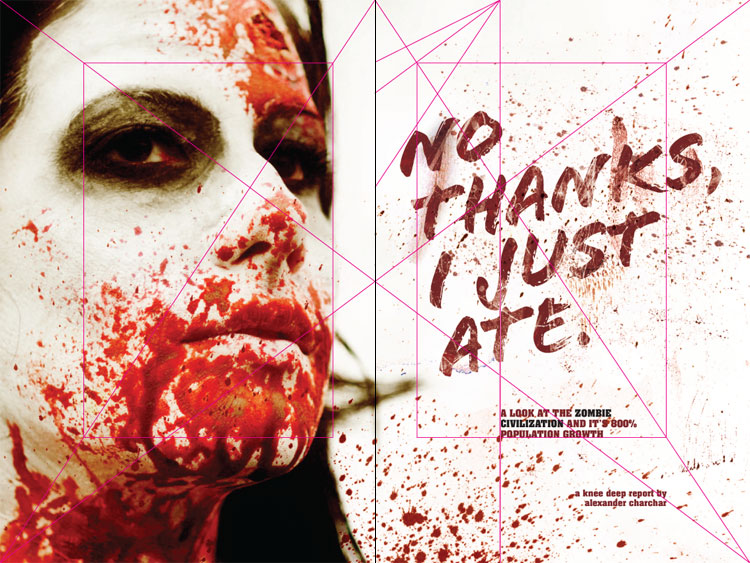
You must have a minimum of two columns per page within a single rectangle. Your article and image should be within the rectangle. If you're aiming for band 4 you MUST ensure ALL your designs have template lines visible.


Using these 'guide' lines try and ensure all of your flat plan 'design' fits within these areas. More info on layout out using these 'harmonious' guidelines can be found on the Memonic website.



STEP 3 - Alternative page layout: the grid systemThe grid system is an elegant yet simple way of designing your page. It too builds on the fibonacci sequence: 1, 1, 2, 3, 5, 8, 13, etc.
Try dividing your page into columns as seen here, then you can decide how many columns will suit your page. Visit this site for further information.

Flatplans


Examples of flatplans that show it's a valid way to begin the whole design process. Brainstorm ideas for your cover, contents and double page spread. Get them down on paper and then move on to PhotoShop.

 If you've started on PhotoShop then that's fine too, just make sure you save jpegs of your initial mock up.

See also Know Your Onions pages 9-11 by Drew de Soto (we have a copy in H2). He explains the point of working out the initial idea on paper.

Wednesday, 16 September 2015

Design Layouts: Gutenberg Diagram, Z Pattern & F Pattern

Several layout patterns are often recommended to take advantage of how people scan or read through a design. 3 of the more common are the Gutenberg diagram, the z-pattern layout, and the f-pattern layout.


The pattern applies to text-heavy content. Think pages in a novel or a newspaper. The pattern isn’t meant to describe every possible design.

The Gutenberg diagram describes a general pattern the eyes move through when looking at evenly distributed, homogenous information. Read that last part again.
The pattern applies to text-heavy content. Think pages in a novel or a newspaper. The pattern isn’t meant o describe every possible design.
The Gutenberg diagram divides the layout into 4 quadrants.
  • Primary optical area located in the top/left
  • Strong fallow area located in the top/right
  • Weak fallow area located in the bottom/left
  • Terminal area located in the bottom/right
The pattern suggests that the eye will sweep across and down the page in a series of horizontal movements called axes of orientation. Each sweep starts a little further from the left edge and moves a little closer to the right edge. The overall movement is for the eye to travel from the primary area to the terminal area and this path is referred to as reading gravity.
Naturally this is for left to right reading languages and would be reversed for right to left reading languages.
The Gutenberg diagram suggests that the strong and weak fallow areas fall outside this reading gravity path and receive minimal attention unless emphasized visually in some way.
Important elements should be placed along the reading gravity path. For example placing logo or headline in the top/left, an image or some important content in the middle, and a call-to-action or contact information in the bottom right.
Designs that follow Gutenberg are said to be in harmony with natural reading gravity.
The claim is these designs improve reading rhythm, by being in harmony with the natural reading rhythm, as well as improving reading comprehension, but there’s little empirical evidence to support the claim.
Again Gutenberg describes large blocks of text with little typographic hierarchy. As soon as you create a visual hierarchy the diagram no longer applies. Keep this in mind with the other patterns described here.

Wednesday, 2 September 2015

Preliminary magazine examples


AS Foundation Portfolio Brief


Print

Preliminary exercise: using DTP and an image manipulation program, produce the front page of a new school/college magazine, featuring a photograph of a student in medium close-up plus some appropriately laid-out text and a masthead. 

Additionally candidates must produce a DTP mock-up of the layout of the contents page to demonstrate their grasp of the program.

Main task: the front page, contents and double page spread of a new music magazine.


All images and text used must be original, produced by the candidate, minimum of FOUR images per candidate.

Excellent student work 2014


Thursday, 19 March 2015

Work to complete 23rd - 27th March


Evaluation:
  • Read the feedback for your question 1 and question 2 drafts.
  • Complete final versions for both questions (both must be presented using a different creative format-look at the ten examples I posted for help).
Blogs:
  • Ensure your coursework is posted on your blog
  • Upload images from your photo shoot to Flickr (create a gallery and embed on your blog).
  • Save each layer of your magazine as a jpeg (to show how the project evolved). Do this for the cover, contents and double page spread. Compile the images on Photoshop and post to your blog.
  • Label every post correctly.
  • Account for any gaps in the blog.
  • Postdate new blog posts where appropriate.